Halal Bros 2 Go is a new quick-service restaurant in Ann Arbor dedicated to serving affordable, NYC-style halal food to students and locals. Despite its surge in popularity, the business still lacks a website for customers to place digital orders. The only existing way to order ahead is through third-party delivery apps, which charge more compared to the standard prices.
As a regular customer who wanted to place pickup orders, I set out to create a mobile-first online ordering prototype that would enable users to browse the menu, customize their order, and pick up their food quickly. The goal was to give the restaurant a simple, scalable online presence.
I undertook this project independently for an advanced design course, establishing the initial concept, conducting research, and eventually creating a high-fidelity website prototype with responsive breakpoints for both mobile and desktop.
Over the first two weeks of the project, I gathered insights through impromptu, quick intercept interviews outside the restaurant. These conversations revealed to me that most customers valued speed, affordability, and reliability. Many of them came for the convenience and wanted to avoid long waits in line.
Additionally, I conducted a competitive analysis of two local favorites, No Thai! and Baba Dari. Both of these restaurants are in a similar price range and rely on quick pickup orders for a large portion of their business. My goal was to understand how they limited long waits, how they structured their menus, and how they structured their checkout flows.
This mix of in-person insights and comparison to competitor sites helped me define a problem statement for Halal Bros 2 Go:
Ann Arbor students and locals desire a quicker, more convenient way to order from Halal Bros 2 Go so they can skip long lines and easily pick up affordable meals during their busy days.
Audience & Goals
Through these research methods, I discovered some common pain points:
Long wait times during peak lunch and dinner hours
No dedicated online ordering option for quick pickup direct from restaurant
Limited access to online menu, causing uncertainty for first-time customers
Frustration with third-party delivery/pickup apps that add extra fees
My goal was to design a product that can improve efficiency, enhance the customer experience, and save users money by allowing ordering directly from Halal Bros 2 Go. This pickup order flow prototype solves these challenges with:
A streamlined flow that allows users to browse, customize, and order in under a minute
Pickup time visibility, so users can manage their time and know when their meal is ready
A mobile-first interface that allows users to quickly access recent orders, reducing friction for repeat customers
I focused on busy Michigan students and local residents who want fast, affordable meals between classes or shifts. These users value quick service, clear menu options, and minimal steps throughout the ordering process.
Below is the primary user persona developed from my early research to guide the rest of my designs.
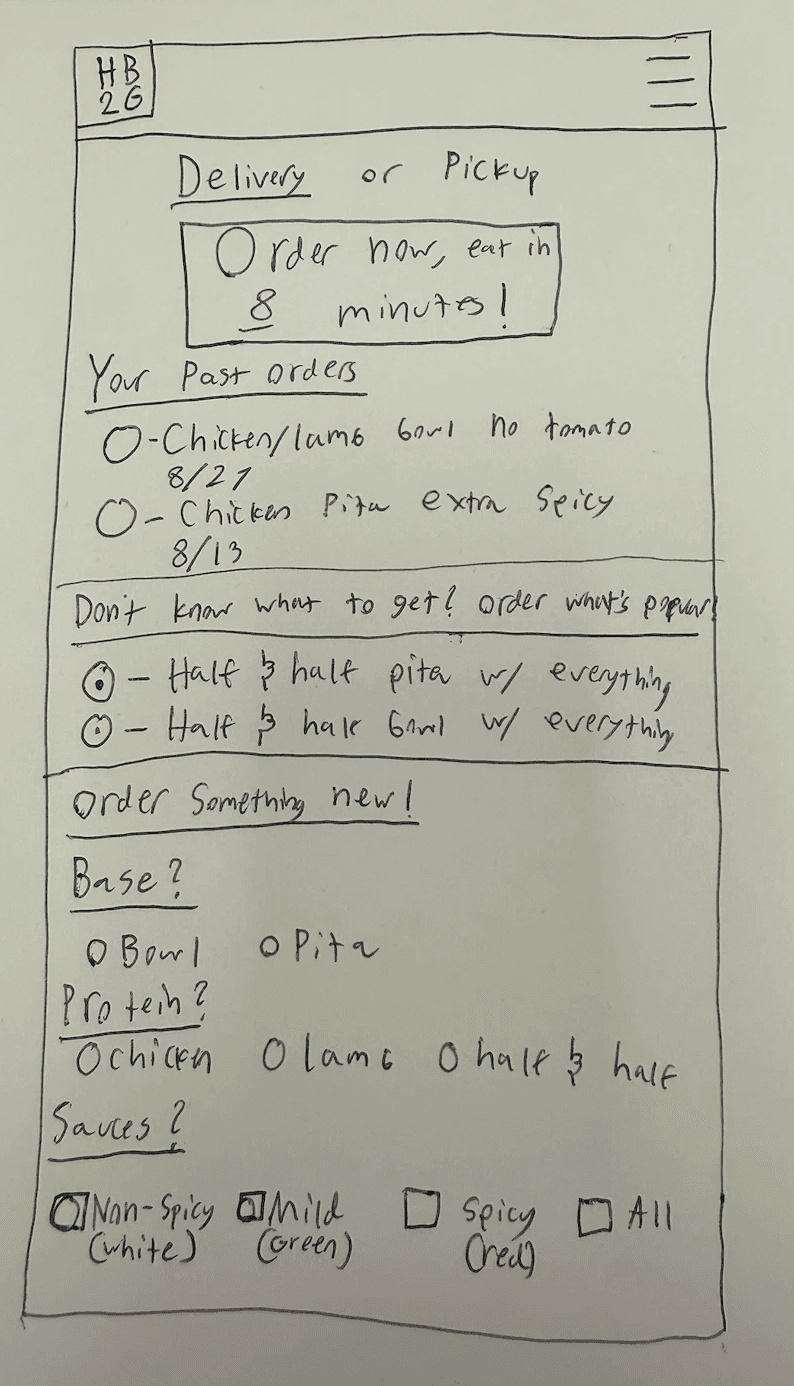
I started the design process by sketching out eight possible ways that the mobile ordering flow could look. This allowed me to get a lot of ideas down quickly and filter out what could work and what definitely wouldn't.
After sketching out these eight possibilities, I got some feedback from fellow UX students and combined the best aspects of each sketch into one main sketch that would help to inform my product view interface.
Typography & Design System
At this point, since I had a solid idea of how I wanted the information to be laid out, it was time to establish a design system.
The first aspect I established was the text styles for the site. The typography system was designed to reflect the energetic, approachable brand identity of Halal Bros 2 Go. I selected Urbanist due to its readability and inviting nature. This aligns with the restaurant's fast-paced feel while still keeping the interface clean. The text hierarchy was created to make clear styles for different use cases, so larger headings would draw more attention while the compact body text could quickly be scanned on a mobile device. After the mobile typography system was created, I repeated the same process for desktop: utilizing the same fonts slightly scaled up for an ideal desktop experience.
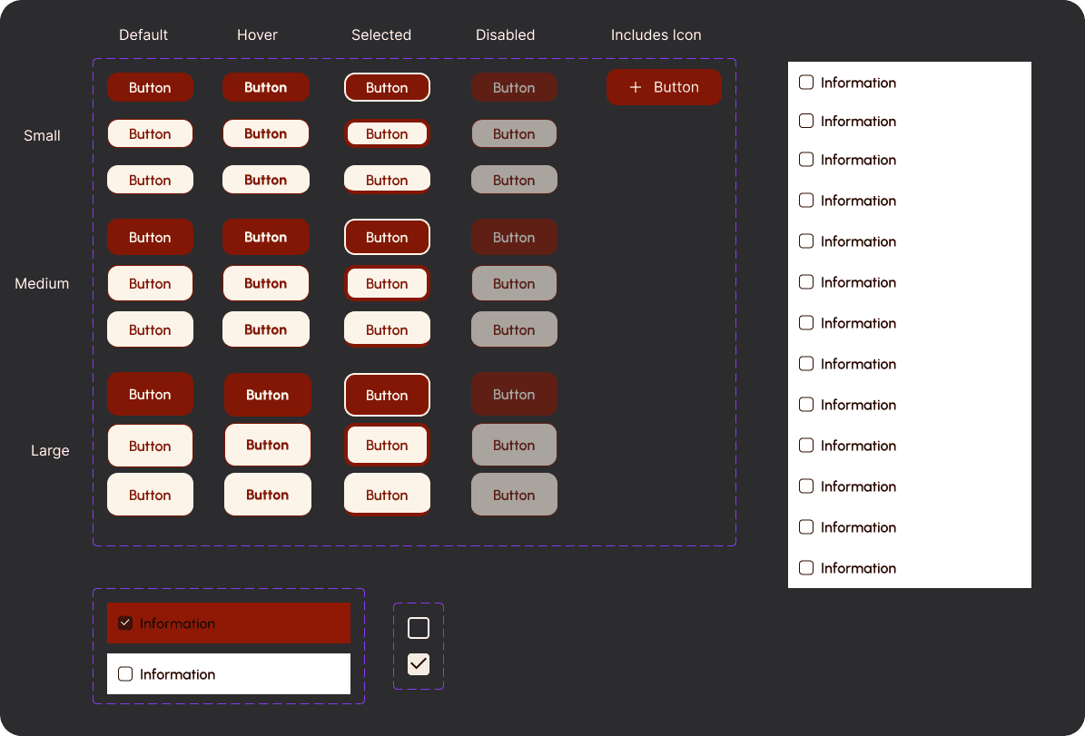
The next step was to begin creating a design system to ensure consistency and scalability across the interface. I built a modular component system in Figma that standardized buttons, checkboxes, and drop-downs. Each button was designed with multiple built-in interactions: default, hover, selected, and disabled. Additionally, each button has multiple size options for improved responsiveness between breakpoints.
I based the color palette on Halal Bros 2 Go's existing logo and Instagram. The palette consists of deep red, warm yellow, and charcoal gray, ensuring strong contrast and visual consistency throughout the site. By defining these colors and components early, I was able to streamline early iterations and guarantee that the final prototype had a unique brand identity and delivered a cohesive look aligned with the restaurant's existing aesthetic. All components and colors were tested for legibility, contrast, and tap-target sizing to ensure best accessibility practices.
Early Iterations
After establishing the design system, it was finally time to create initial frames for the mobile flow. The user flow is intended to be simple; users go from the homepage -> menu -> product view -> cart -> checkout -> order confirmation. Below are the early high-fidelity wireframes based on my sketches, initial user research, and the design system.
Usability Testing
The next step in my process was conducting usability testing to gather deeper insights into user behavior. I developed a detailed usability test plan that included screeners, follow-up questions, and a task where participants were asked to order a mixed bowl with no tomato and mild sauce. This scenario reflected a common user action and allowed me to observe how participants navigated the prototype, identified pain points, and expressed their overall impressions of the experience.
After creating the usability test guide and deploying my prototype to UserTesting.com, I received results from users and identified several opportunities to refine the prototype and improve usability:
Missing Features: Users felt some key aspects were missing, requesting a tipping feature and a "No Sauce" customization option, so I added them to improve flexibility and convenience
Button Sizing: Several users accidentally clicked the wrong elements, prompting me to increase the size of nearly all interactions and spacing between them to improve tap accuracy and accessibility
Interaction Simplification: Redundant buttons and icons were removed to streamline the user flow and not confuse users with unnecessary interactions that they did not understand the purpose of
After gathering all of the user data, I used Miro to separate related pieces of data into themes I can use to iterate further. This affinity diagram can be seen below.
Revised Design
After receiving feedback, I iterated on the wireframes to establish a high-quality prototype based on usability test results. These revised designs can be seen below.
While the differences are subtle, the revised design removed a lot of friction that the initial frames had, resulting in a smooth ordering flow that allows users to get what they want quickly.
Desktop Breakpoint Design
Now that the mobile prototype was revised and polished, it was time to create a desktop breakpoint to ensure responsiveness across devices. While user testing confirmed that most participants preferred a mobile version for quick food orders, designing a desktop experience remained essential for users who browse or place orders from a computer.
The desktop breakpoint was designed to maintain visual consistency with the mobile layout using the same color palette, design system, and typography hierarchy while adapting the navigation, imagery, and spacing for a wider viewport. Despite these adjustments, the core brand identity and interaction flow remained consistent. This ensured that the Halal Bros 2 Go experience stayed accessible and cohesive across platforms.
Key Adjustments
Expanded Navigation Bar: Replaced the mobile hamburger menu with a wider navigation bar displaying individual links for easier access
Cart Overlay: Transformed the standalone cart screen into a right-side overlay to improve usability and reduce unnecessary navigation steps
Expanded Imagery and Spacing: Increased image sizes and adjusted layout spacing to optimize the desktop experience and enhance visual balance
Below are the finalized screens for the desktop breakpoint.
Usability testing confirmed that users could complete a full order flow quickly and confidently, validating the focus on speed and clarity. After revising these designs, I am confident that participants can easily place pickup orders without any confusion or help needed.
While this project has not been implemented yet, I believe it can be used as a proof of concept to show how much more effective Halal Bros 2 Go's business model can be if they take pickup orders directly. This project demonstrated how impactful user-centered design can be for small-businesses, as even brief intercept interviews led to meaningful insights and product decisions.
Overall, this project helped me move out of my comfort zone a bit and design for another business without ever meeting with the client to discuss the product. It reinforced the importance of grounding design in real user behavior, and both the in-person interviews and usability testing were invaluable to informing my overall product design.
I view this project as a huge step forward in my product design career, as this was the first project that I was the sole designer on that included multiple breakpoints. Previously, I had designed native mobile apps, so this experience taught me what designing from a mobile-first perspective and creating responsive breakpoints is like. This project boosted my confidence as a designer by showing that I can have a real impact on businesses as a one-man design team.
Next Steps
To continue developing the Halal Bros 2 Go site, I would:
Meet with the restaurant owners to discuss my product and if they would consider implementation
Flesh out more screens to create a complete site rather than just the ordering component
Conduct further usability tests and iterate on the design to improve professionalism and overall quality
I believe that once I have completed these steps, this Halal Bros 2 Go site could offer real value to the business by improving operational efficiency and gaining customer awareness.


