Role: Sole Product Designer and Researcher
Timeline: 6 Weeks
Tool: Figma
UpBeat is a mobile app designed to enhance the experience of both DJs and partygoers at house parties and other fun events. It allows users to request songs anonymously, vote on others’ requests, RSVP for events, check out trending party tracks, and share party recaps, all in one social and music-focused platform.
This project was part of a Digital Product Design course, where I was tasked with identifying a target audience and designing an app that solved a real problem they face. I chose to focus on the house party environment, drawing from both user interviews and personal observations as a DJ myself.
I completed this project independently and was responsible for the entire product design process from concept ideation and user research to wireframes and a high-fidelity prototype.
Through interviews, concept testing, and field observations, I identified a common friction point at house parties: the disconnect between what DJs play and what partygoers actually want to hear.
This led to the following problem statement, which guided the direction of the app:
House partygoers want a simple and anonymous way to request songs or genres so they can easily influence the music around them to improve their party experience and see what others want to hear without disrupting the party.
This problem matters because music heavily shapes the energy of a party, and both DJs and guests benefit when the music reflects the crowd's interests. DJs often struggle to read the room or receive helpful feedback, while partygoers frequently feel ignored or frustrated when their requests go unheard. By enabling anonymous song requests and upvoting, UpBeat helps DJs identify the most popular choices without being interrupted and ensures attendees feel more connected to the music experience.
Specific pain points uncovered through early research included:
DJs being overwhelmed with song requests, often with no indication of group interest
Partygoers feeling ignored when their favorite songs aren’t played
Difficulty finding songs played the night before, especially when the name wasn’t known
UpBeat addresses these problems through digital song requests, a live upvoting system, and post-party features like saved playlists and recaps.
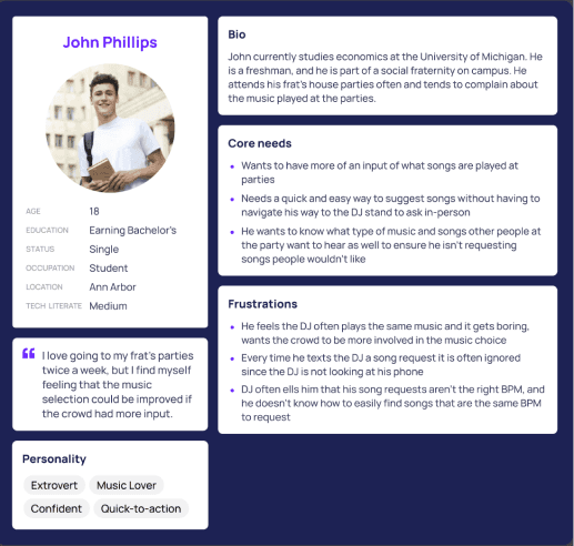
The target audience is primarily young adults aged 18–28 who frequently attend house or Greek life parties and value having control over the music experience. Formative research, including a concept study and short field study, confirmed that this audience consistently struggles with these issues and would find value in an app like UpBeat.
Below is the primary persona created based on these early insights.
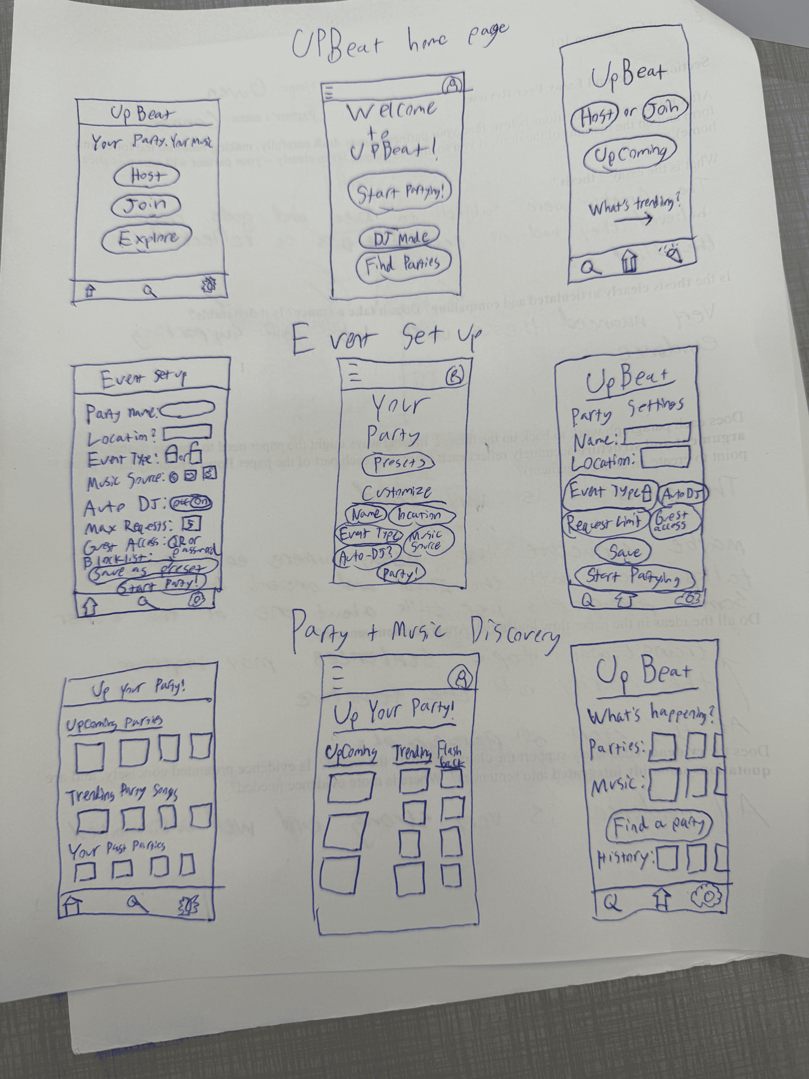
I began the design process with quick hand-drawn sketches to explore layout, user flows, and the overall structure of the app. Since this was a party-focused product, my early designs aimed to prioritize fast, intuitive interactions that wouldn’t distract users from the experience around them.
Low-Fidelity Wireframes
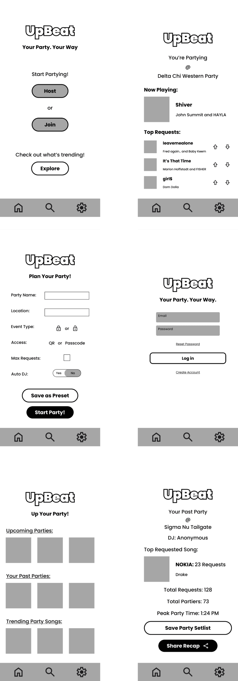
These black-and-white wireframes were the next step. They were used to establish the core features of the app, such as requesting songs, viewing trending tracks, and exploring upcoming parties.
Incorporating Feedback & Creating the Design System
After receiving feedback, I made several improvements:
Removed the large "UpBeat" logo from every screen, limiting its use to pages like onboarding or log-in, where branding made more sense.
Added descriptive text under images on the Explore page to clarify what each tile represented.
Distinguished the “Trending” link on the homepage by placing it in a boxed section, visually separating it from CTA buttons.
These adjustments ensured a smoother, more understandable experience before applying any visual styling.
Once the app structure was in place, I created a visual design system to match the energy and excitement of a real party environment. I wanted the interface to feel fun, immersive, and reflective of the product’s purpose.
For the color palette, I chose bright cyan, neon pink, and dark blue: high-contrast colors reminiscent of disco lights and arcade visuals. I experimented with gradients early on but found solid tones more effective for readability and aesthetic clarity.
To complement the visual style, I selected Poppins as the app’s primary font: a clean, rounded typeface that balances personality with legibility, especially in a fast-paced social setting.
I also built several reusable components to keep the interface consistent and scalable:
Glowing neon buttons to enhance depth and grab attention
A componentized navbar for easier management of different active states
A custom logo with blue text and a pink shadow, giving it a stylized, retro-block effect
The goal was to create a UI that felt like a seamless part of the party. Rather than pulling users away from the experience, UpBeat needed to be quick, expressive, and easy to use in seconds. Thus, allowing users to request a song without missing a beat.
High-Fidelity Wireframes
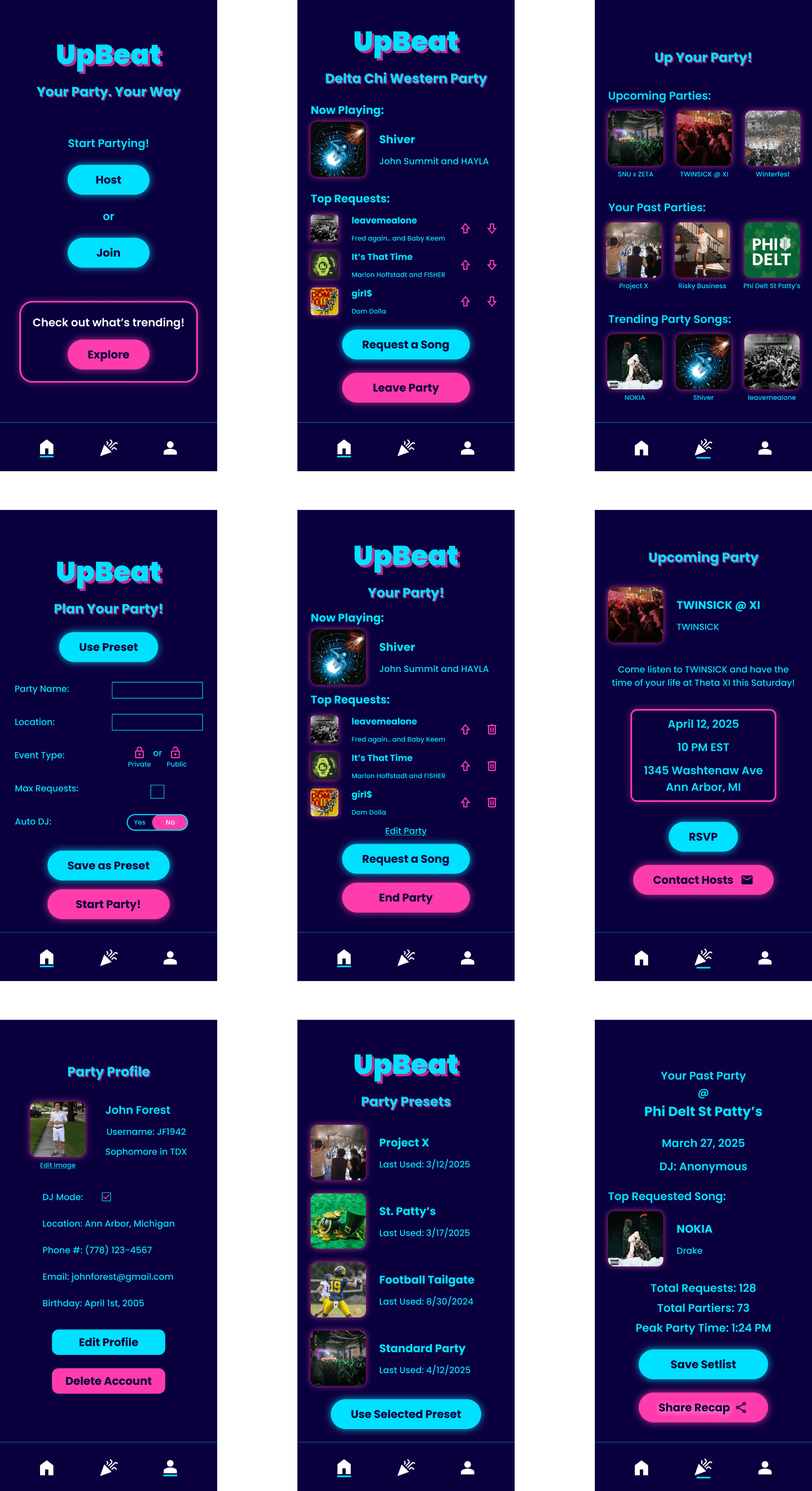
I then applied the full design system to bring the screens to life in high-fidelity.
These mockups incorporated the color palette, type system, glowing effects, and layout refinements. This resulted in a cohesive, party-ready interface.
UpBeat resulted in a vibrant, high-fidelity prototype that connects DJs and partygoers, allowing anonymous song requests, upvoting, and party RSVPs, all while maintaining a fun, immersive party experience. Below is a link to the full prototype and some of the final high-fidelity frames.
Reflection
This project marked a major turning point for me in using Figma; for the first time, the tool felt like it was enhancing my design capabilities rather than slowing me down. I developed a much stronger grasp of the fundamentals of product design and systems thinking.
One key area of growth was learning to prioritize spacing and layout consistency. Instead of eyeballing margins, I implemented a strict 24px margin system across all screens, creating a more cohesive and polished product. Maintaining consistent structure made a noticeable difference in how unified the interface felt.
Another important realization came from the role of color in shaping user experience. By using a bold neon pink and blue color scheme, the app immediately communicates a sense of energy, fun, and party culture. Without this intentional color choice, the app would not feel nearly as engaging. This project made me appreciate how crucial visual language is to setting the right tone and expectations for users.
Next Steps
To further develop UpBeat, I would prioritize:
Implementing social features, such as adding friends, commenting, and sharing party photos
Refining the DJ/Host experience to differentiate their interface more clearly from regular partygoers
Building a dedicated “Request a Song” page that integrates search functionality and trending results
Reaching out to local fraternities and event hosts to gauge real-world interest and gather feedback for future iterations
I believe that with additional features and real user validation, UpBeat could offer a valuable new way for DJs and attendees to collaborate and make parties more interactive and fun.


